

And no, I will not tell you what my company app is.
You must log in or register to comment.
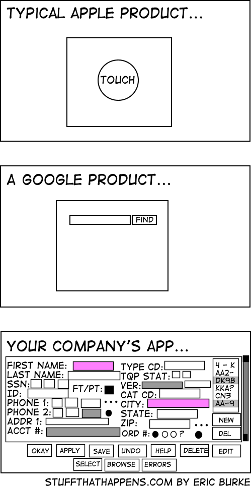
People at my company are like “why are we wasting screen real estate with white space?” and I imagine they see the last image is an ideal UX
We’re currently trying to convince our client, that 4 different levels “mandatory” fields in a form are about two too many.
The UI they sketched looks like shit, but they think it’s absolutely necessary.
But there was this one customer, where it was so helpful to know he’s left handed. So now this is a necessary information /s
For the first two you need hoops and tricks for it to do what you want, the last one has bad UX. I choose the later.
I would argue that the first two require you to jump through hoops for edge cases, while the last one requires you to jump through hoops for every case.
If I’m going to jump through hoops anyway I’d like some degree of control over the experience.
Wrong, the google product is dead
And the Apple product would probable say “gloat about me to your friends”
And it was one they bought, just to kill it… Google: the sadist of the tech world.
Google and apple already know who you are, the company at the bottom doesn’t
Lol, that’s a fun angle. They don’t need all those fields coz they just get your information the other way
There is a clear difference here: the first software, you pay to use. The last one, you get paid to use it.
100% this. I used to work at a company that sold software that mechanical engineers used all day, every day in a certain field. Our app looked like the last pic but with better alignment.
People who are competent want all the things on their screen all at once all the time. They also want keyboard shortcuts.
An automation API would also be nice please… (i hope it doesn’t require an additional $4000/y licence)
Honestly, I’d rather have an ugly app with everything right there than the terrible UX trend that’s happening of everything being hidden behind 8-10 different menus just to make the home screen “clean”
Good.
You need all that information, but no more. This allows me to efficiently supply it, properly formatted, and to supply no more. Assuming this is using standard widgets instead of reinvented ones, the only better thing would be an API so we can roll our own form or automate.
The FAANG approach relies on an army of people to do the data entry equivalent of mind reading, or invasiveness, or both, and all so that you have to look at a few less boxes for a minute.
The honestly prefer the bottom one than the modern 50 step wizards that take 10 seconds for each page to load, and load an ungodly amount of JS scripts.
A company I worked for was using an ancient bug tracking tool (called Pivotal) that looked like a 90s site. It was so fast and responsive. Later, we moved to something modern. It was 10 times worse, significantly slower and overly complex.
I hate when websites don’t have the username and password together. When you have to put in the username click ok then have some JavaScript hide the username prompt and prompt you for your password. Makes it more painful when trying to use a password manager. Especially one that isn’t built into the web browser by default.
KeePass autotype is amazing for these situations. Very customizable.
If your company is implementing an app that is basically a toggle switch or power button, it’ll probably look like the first one. If your company is implementing an internal search engine, it’ll probably look like the second one. If anybody is implementing a data entry system meant to be used by trained individuals at a workstation, its gonna look like option three. You might as well complain about a CNC mill being more complicated than a screwdriver, they’re different tools.
Everyone knows what DK9B is, we don’t need better labels.
Donkey Kong 9 Billion
And you are asked to add more fields and buttons, but the interface was made in a very old version of visual studio and it breaks something every time you open it up in the editor.
I hope that’s a power user app, right? RIGHT!?!
No it logs the days u showed up so it can deduct from ur salary upon missing 2.3minutes of your shift
Also it uses Times New Roman font because companies believe it is the only font in existence and should definitely be used in UI instead of fonts meant for UI like Segoe UI on Windows which has UI in its name
We have to get permission from Marketing, the CEO, the Pope, and the ghost of Queen Elizabeth 2 to change anything about the layout, so we just jamb in more buttons.


