ObstreperousCanadian@lemmy.ca to Programmer Humor@lemmy.mlEnglish · 1 year agoThis is painfully truelemmy.caimagemessage-square26fedilinkarrow-up116arrow-down12file-text
arrow-up114arrow-down1imageThis is painfully truelemmy.caObstreperousCanadian@lemmy.ca to Programmer Humor@lemmy.mlEnglish · 1 year agomessage-square26fedilinkfile-text
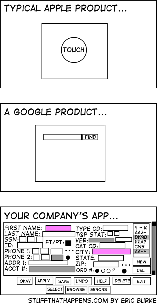
minus-squarePeriodicallyPedantic@lemmy.calinkfedilinkarrow-up3·1 year agoPeople at my company are like “why are we wasting screen real estate with white space?” and I imagine they see the last image is an ideal UX
minus-squareAggressivelyPassive@feddit.delinkfedilinkarrow-up2·1 year agoWe’re currently trying to convince our client, that 4 different levels “mandatory” fields in a form are about two too many. The UI they sketched looks like shit, but they think it’s absolutely necessary.
minus-squareJoKi@feddit.delinkfedilinkarrow-up0·1 year agoBut there was this one customer, where it was so helpful to know he’s left handed. So now this is a necessary information /s
minus-squareMonkderZweite@feddit.chlinkfedilinkarrow-up1·1 year agoFor the first two you need hoops and tricks for it to do what you want, the last one has bad UX. I choose the later.
minus-squarePeriodicallyPedantic@lemmy.calinkfedilinkarrow-up0·1 year agoI would argue that the first two require you to jump through hoops for edge cases, while the last one requires you to jump through hoops for every case.
minus-squareneo (he/him)@lemmy.comfysnug.spacelinkfedilinkEnglisharrow-up1·1 year agoIf I’m going to jump through hoops anyway I’d like some degree of control over the experience.


People at my company are like “why are we wasting screen real estate with white space?” and I imagine they see the last image is an ideal UX
We’re currently trying to convince our client, that 4 different levels “mandatory” fields in a form are about two too many.
The UI they sketched looks like shit, but they think it’s absolutely necessary.
But there was this one customer, where it was so helpful to know he’s left handed. So now this is a necessary information /s
For the first two you need hoops and tricks for it to do what you want, the last one has bad UX. I choose the later.
I would argue that the first two require you to jump through hoops for edge cases, while the last one requires you to jump through hoops for every case.
If I’m going to jump through hoops anyway I’d like some degree of control over the experience.