
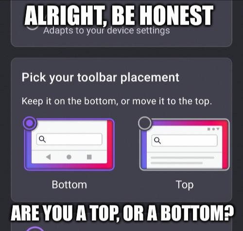
Bottom, it’s just easier
I find that to be true but it bothers me while srolling.
It’s supposed to go away when scrolling down. It only pops up again if you’re scrolling up, but then you’d be looking at the top of the screen anyway.
I know, that mechanic feels wrong to me. Can’t really explain how.
I know what you mean. If you think about it it feels wrong, but when you’re just using it it somehow doesn’t.
Ah, the conflict of interests. It’s okay, you can be a vers
Top. My desktop has the adress bar at the top so I want my phone to be the same
Bottom. You guys hold your phone from the top?
I hold mine upside down
Ah easier that way
Bottom for firefox, top for windows start bar. Switchhhh
idk why I do this also
I got my pc hooked up to a 4k tv like a normy, so it just works and looks better to have start up top but also having the browser bar up there is too much
Phone: bottom Tablet: top
So, uh, switch I guess?
Bottom obv i am not a barbarian
My phone’s to big. Bottom so my thumb can get to it.
Top. Always top. That’s where all the tools I need for an application should be. Bottom area is for system tools.
It keeps things nicely separated, less risk of fat fingering something I don’t want to hit.
yeah, let’s just put all the important tools in the hardest to reach spot on the screen
top makes sense on desktop, but on phones bottom is just logical. took way too long to get to it already because of the exact notion you expressed
system tools
Not if your phone has hardware buttons
Bottom only in bedroom
Bottom :3
Definitely the top, otherwise I am misclicking the tooolbar.
But also, I am mostly a landscape smartphone user. Which is why I’d prefer 16:9 instead of whatever the hell this wide thing is. But with bezels. You can hold onto a bezel with thumb. Also a separate navigation button like I had on my Moto G5s Plus 🥰.
Landscape
Phone
You’re a monster
Also permanently enabled Desktop mode on browser.
But I also increased minimum width in developer settings from default 395dp to 705dp. 600dp and above is considered a tablet by apps. Fits so much content on 1 screen.
That’s a pretty tiny top.
Top, although it takes more travel time for my thumb or index, depending on use case, it just feels more correct that way.
Bottom, phones got too big and I want to be able to reach it with one hand.
Even so, I still prefer top.
top bottom is just unnatural the browser bar belongs at the top and anyone who puts it at the bottom should be put down like the dog they are


