

Since Gmail doesn’t have the obvoious envelope anymore I often open it when I want to open Maps. My brain ist like “M for Maps”.
Triumph of visual design over interactive design. These days, most “designers” only care about graphics visually. The much deeper science of how people use and understand things is beyond them. Worse, they think the problem is that everybody else does not “get” visual design.
Style over substance.
Case in point: Every single thing Microsoft is doing in Windows these days.
It’s not even more aesthetic. Just more unified in branding.
And the interface of their apps are still incoherent af. I don’t know how, but they manage to make things worse every time
Whatever. It sucks ass is the point.
My point is that it’s also ugly.
I actually think these are fine. If I can quickly recognise each on my homescreen (I don’t use labels) then it’s fine, and I’ve never had a problem with any of these.
I like it because each company each has its own set of apps, and they have somewhat unified app icons.
Proton is the same, which similar icons as google but with their own unified branding.
I like it, personally.
What I keep seeing: $ $ $ $ $
Also I’m sure the designs are absolutely as humanly possible adapted to perfectly achieve their goal. Too much money, people, and time involved for this not to be the case.
And the goal was never ease of use, that doesn’t bring in any more money when you have a monopoly. Engagement & forced ads do.
(By ‘forced ads’ in this case I do not mean directly advertising a specific product, but forcing you to pause your thoughts to specifically and consciously think about Google making the name/brand ever more part of your actual life and as such its shitty behaviour gets normalised, even trusted - thats just how our brains work even when we think otherwise … and I hope we all think of Google as a curse on humanity.)Color is the first thing the eyes tend to notice, then shape, then lines and details. The new icons all look the same at the edge of my vision, I have to look at them straight on to distinguish them. Individually each one is fine but together, like what the hell?
I don’t rawdog Google icons anymore anyway, I use an icon pack
I wouldn’t even call this “aesthetics”. Rather “conceptual homogeneity” or something like that. It’s what happens when you strive for a uniform look over a useful or visually pleasing one.
In some countries uniform look at least provided good for society. In this case it provides only profits for to 1%.
Good for society:

What would happen if people deserted Google products in droves?
Mail:
- Vivaldi mail
- Android client: K-9 Mail
- Desktop client: Betterbird
Cloud:
- Mega [referral URL]
Maps:
Meet:
Calendar:
- Vivaldi calendar, syncable with a myriad of clients.
Here’s an exhaustive list of Mostly excellent “free” software that I use.
Please also consider supporting the myriad of developers who offer their superior products for free, open source, without ads.
“What if I paid for all my free software?
I’ve always felt guilty by taking for granted the rare breed of virtuous humans that provide free excellent software without relying on advertising. Let’s change that and pay, how much would I “lose” anyway?” —https://www.cynicusrex.com/file/takemymoney.htmlWhy not use Keybase for cloud and proton for mail?
I dropped all their services as soon as Proton promoted crypto"currencies", i.e., multi-level marketing pyramid schemes.
Haven’t tried Keybase yet.Do you disagree with their reason?
Responsible financial diversification requires holding some assets outside of the traditional government controlled banking system.
They didn’t say they were going all in. They aren’t continuously promoting - at least not that I’m aware. They were just being open and honest about how they’re handling their finances.
”Do you disagree with their reason?
Responsible financial diversification requires holding some assets outside of the traditional government controlled banking system.
They didn’t say they were going all in. They aren’t continuously promoting - at least not that I’m aware. They were just being open and honest about how they’re handling their finances.”
I absolutely disagree.
- “Responsible” and “Bitcoin” is an oxymoron due to the inherent multi-level marketing pyramid/Ponzi scheme aspect of crypto“currencies”.
- “Money corrupts; bitcoin corrupts absolutely.
Disregarding all of bitcoin’s shortcomings, a financial instrument that brings out the worst in people—greed—won’t change the world for the better.” —https://www.cynicusrex.com/file/cryptocultscience.html
“Responsible” and “Bitcoin” is an oxymoron due to the inherent multi-level marketing pyramid/Ponzi scheme aspect of crypto“currencies”.
First, you’re removing the next two words “financial diversification” from the statement. Your own personal opinions and emotions aside, financial diversification is not a bad idea. It’s all about percentages and risk calculations. I would agree with you if they went “all in” on crypto, but they didn’t say that.
Second, you’re lumping in bad people with good tech that has solved a very specific problem - the ability to transfer funds without relying on a central bank or authority. Is email bad because the majority is spam? No. Is the internet bad because the dark web exists and thousands if not millions of crimes are being carried out on it? No. Are encrypted messengers bad because they allow criminals to send message? No. Same concept here. There can exist a good technology that gets abused by bad people.
“Money corrupts; bitcoin corrupts absolutely.
You can stop at “money corrupts”. bitcoin is money and money corrupts.
Disregarding all of bitcoin’s shortcomings, a financial instrument that brings out the worst in people—greed—won’t change the world for the better.”
Disregarding all of the U.S. Dollar’s shortcomings[1], a financial instrument that brings out the worst in people—greed—won’t change the world for the better.”
Fixed it for you.
[1] The US spent 877 BILLION dollars on its defense budget (as much as the next 10 countries combined!) to ensure the USD keeps its power.
“Responsible” and “Bitcoin” is an oxymoron due to the inherent multi-level marketing pyramid/Ponzi scheme aspect of crypto“currencies”.
First, you’re removing the next two words “financial diversification” from the statement. Your own personal opinions and emotions aside, financial diversification is not a bad idea. It’s all about percentages and risk calculations. I would agree with you if they went “all in” on crypto, but they didn’t say that.
Gambling or buying into a pyramid scheme doesn’t belong to the category of financial diversification, let alone responsible financial diversification. Responsible financial diversification is investing in skills, property, purchasing cooperatives, official/institutional crowdfunding projects with sustainability in mind—not purely profit, ethical index funds, et cetera.
Second, you’re lumping in bad people with good tech that has solved a very specific problem - the ability to transfer funds without relying on a central bank or authority. Is email bad because the majority is spam? No. Is the internet bad because the dark web exists and thousands if not millions of crimes are being carried out on it? No. Are encrypted messengers bad because they allow criminals to send message? No. Same concept here. There can exist a good technology that gets abused by bad people.
All whataboutism fallacies. Crypto“currencies” incentivize greed. Not so for email, the Internet, messengers, et cetera. The only legitimate usecase for these alternative currencies is financing whistleblowers, journalists, individuals who have to break unethical laws and are therefore disconnected from the banking system.
“Money corrupts; bitcoin corrupts absolutely.
You can stop at “money corrupts”. bitcoin is money and money corrupts.
Bitcoin more so because of its multi-level marketing / pyramid scheme aspect. When one buys USD or EUR one doesn’t try convincing their peers to buy it too so their own wealth goes up.
Disregarding all of bitcoin’s shortcomings, a financial instrument that brings out the worst in people—greed—won’t change the world for the better.”
Disregarding all of the U.S. Dollar’s shortcomings[1], a financial instrument that brings out the worst in people—greed—won’t change the world for the better.”
Fixed it for you.
[1] The US spent 877 BILLION dollars on its defense budget (as much as the next 10 countries combined!) to ensure the USD keeps its power.
Whataboutism fallacy again.
agree to disagree
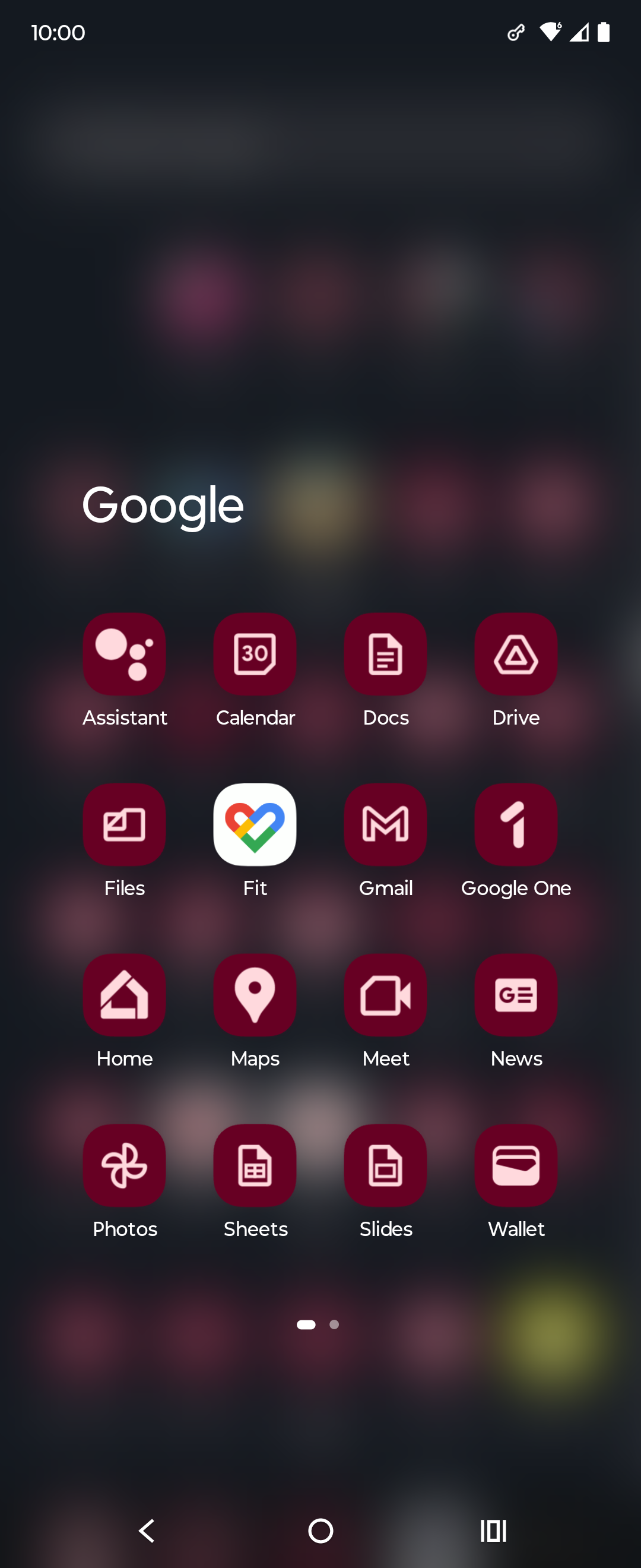
The homogenization of these icons has been a long source of consternation for me.
They’re barely functional as icons; you can scroll right by them and miss them; which makes finding the apps in a list of apps a bit annoying sometimes. Removing each icon’s unique color scheme and replacing it with the ‘company 4 colors’ was the stupidest fucking idea ever.
Even more infuriating is how they keep renaming the applications to unexpected things every so often; so they move around; and it’s dreadfully annoying to remember if they prefixed the name of the app with a G or something else completely different, which renders strict alphabetical sorting a bit moot.
It can get even worse. My phone lets me do this to my icons which is ridiculous. I think this was opt-in but now that I’m going through my settings again I can’t actually figure out how to turn it off lol
Plus the art they started using in gdrive. The art on its own is cool but within the Google ecosystem just feels like… what is it even… why… ugh I hate it.

Corporate Memphis. It’s an art style a lot of people hate, and I can understand why.
prevent body shaming by only showing obese/disfigured people so society accepts it as a healthy norm
Corporate memphis does incorporate a sort of identity vagueness.
Almost all human features, body, skincolor are in a uncanny valley. Non-personal enough to be general yet similar enough to be relatable to pretty much any theoretical demographic.
In reality it falls flat. Many people (non partisan) dislike it because of how artificial and shallow it feels.
What it is definitely not is a deep plot to change the social perception of checks note people with non idealistic body features.
Google has no economic incentive to improve your opinion of disabled people who are equally part of this group you appear to find non acceptable to exist in the workforce.
Not Google related, but whoever decide that the best color scheme for an Office suite should be light grey text on a white background deserves to be flogged.
The absolute worst is the idiotic “let’s make all app icons the same shape” thing.
I filed a very irritated Radar / Feedback (Apple’s terms for bug reports) with Apple when the icons for apps all turned to rounded squares. I compared them to Google’s icons and challenged them on making everything harder to distinguish.
I hate contemporary GUI design. Not all of it, but probably half.
oh noooo icons sharing a common design language and color scheme? the absolute horror.
if you can’t tell the difference between these icons i have a great educational resource for you

nah I still recognized all of them as google products bc they use the same 4 colors, but in different interesting ways. gmail was all red but a letter shape. Maps was a red pinhead. drive was a triangle but used all the colors but red. Calendar was a less noticeable shape but instantly recognizeable as a tabletop day calendar. now everything has to use all 4 colors and the shapes are so small that the colors can’t do enough on a phone screen to differentiate themselves.
They already had a common design language and color scheme. Now they have a samey-ness to them that takes away visual interest.
Anyone else this there’s actually nothing at all wrong with the “New” row of icons? Except for the triangle one, which is terrible in its “Original” version as well, as it indicates absolutely nothing about its app (I believe it’s Google Drive, right?). All the rest are clearly distinguishable, and have relevance to what the app does.


