
RIP in peace Windows Phone 10. Still the best home screen setup ever.
Say what you will about Microsoft, lemmys, but Windows Phone 10 had great performance and battery life. It’s a shame that it was nuked because MS couldn’t bring themselves to go all the way on the Android bridge.
They also messed up Nokia before killing Windows Phone. Nokia’s Symbian used to be a serious competition to android.
Symbian was a fantastic OS, but it never competed with Android in any meaningful way. Nokia was already circling the drain when Microsoft bought them and first Windows phones (Lumias) were fucking awesome. And then fucking moron Nadella killed Windows Phone.
When Microsoft bought Nokia, Steve Balmer (ex-Microsoft) was at Nokia helm. His work with Nokia was so much in the interest of Microsoft that he was rewarded with head chair of Microsoft not much time later.
You mean Elop? Ballmer was MS CEO when MS bought Nokia, but they were doing fairly well in the beginning. Fucking moron Nadella took over and killed Windows mobile. Despite publically admitting later that it was a mistake, he’s still a fucking moron.
Nokia’s Symbian was shit and you’re the only person I’ve ever heard saying anything positive about it. To be a serious competitor to Android or IOS you need to have as much apps on the store and Symbian had very few.
Believe it or not: Straight to jailbreak.
There is a tweak, which I don’t recall even having on Android, that lets you select tons of apps and move them around, you know, like you could in a desktop environment… I wonder how much time will take to have that.
(Probably some 3rd party launchers or Android skins allow this, but I can’t do it with Pixel Launcher).
Welcome to 2013, Apple fans! Maybe in 5 more years you’ll get home screen widgets.
Welcome to 2013, Apple fans! Maybe in 5 more years you’ll get home screen widgets.
We actually do have home screen widgets, as of like 2020. They got it sometime before I had my iPhone. And an app drawer!
As a former Android user, my iPhone home screen looks wildly different from people who’ve had iPhones for many years. I have very few icons on my home screen, I have widgets taking up most of the top of the screen to push the icons I do have down near my fingers (because Springboard is still stupid as of iOS 17, as this gif is pointing out), I have more widgets to the left (“Today View,” Apple calls this, it’s basically just a scrolling widget section), and then the app drawer equivalent to the right (which Apple calls “App Library”). It’s clean and beautiful and reminiscent of my lovely Nova launcher setup I had on my beloved OnePlus 7T Pro (may it rest in peace).
Whereas most longtime iPhone users just have page after page after page of apps and folders. Every app they own is on there somewhere. Which is ridiculous since on iOS you can just swipe down, type the first few letters of the app, and there it is.
Before the app library existed you just had to have all the apps on a page and could not hide them. I ended up having like 20 page of apps. I eventually cleaned things up and have a page with apps I use, another page of widgets I use, and that’s it. But it took me years before I thought to do that.
We had them before that but they were different and not a lot of stuff made use of them
2013? Pretty sure you could do this on Android waaaay before that.
My first Android was an HTC Hero, which was released in ~ October of 2009.
One of the first things I did was swap the location of the Maps and Store icons to make it easier to reach on the edge of the phone.
I recall people complaining that same year that the iPhone 1 couldn’t copy or paste text.
:)
I remember having this feature on my jailbroken iPhone in like 2009. Wild that it took this long.
Welcome to 2024, Apple hater! All the things you bash Apple for already exist, but you’re so blind you can’t take 5 minutes to do some homework about it. This whole thread is about icons not snapping to a grid, imagine being so petty you have to bring out the full hatred for something so meaningless. I’ve never once heard an Apple fan flame android OS like this
Bro, you can’t be for real, can you? Apple fans have been shitting on Android non-stop since it was created.
Well this is good news. I never owned an Apple product until my recent purchase of an iPad Mini.
I was nervous about switching from an Android tablet, but everything went great until I tried to move my home screen icons where I wanted them, and resize a weather widget the way I wanted it. Neither worked, and I had to laugh at how ridiculous it was.
I’m very much looking forward to version 18 now.
I’m not sure I understand what we’re talking about. When you install an app on iOS, the icon pops onto the home screen or an adjacent page if there’s no room. Can you not move the icons after that? I know you can put them in folders.
At least on my iPhone (no idea if iPads are different) you can reorder, but the icons will always be “dense” meaning no free spaces between them. They will always align in full rows beginning from top left. You can put stuff in folders, and you can change the order, but not have one icon in the third row, without the first and second row being fully populated with icons.
Apple fan boi here.
I also love to shit on Apple.
Some of the big reveals are so dumb. They just give things a different name to blow your mind.
“Omg! They invited spatial computing!!!”
This is an April Fools, right?
No way a fancy top end smartphone in 2024 doesn’t have this extremely basic feature from over a decade ago that everything has…
You would think that. But as a person having an iPhone… No it is not. At least the part of iPhones currently not having that option. App-Icons on your “desktop” will always align in dense rows from top left to bottom right, with no free spaces allowed.
It is a bit weird, and I don’t really see why, since you can change the order of icons in this dense row-grid. I am glad Apple warms up to the fact that people might actually want some kind of customization on their devices and not everything “the way Apple decrees it”.
But to be really honest… I did not even notice prior to this post, and I had all Android before switching to my current iPhone. So at least for me this is a really small non-issue, and maybe a nice-to-have feature.
I had an iPad for a while and it definitely bothered me. Really just about everything did. It felt like I had to fight with it to do just about anything I wanted to do.
Well, the issue is just that you’re not thinking with the Apple mindset. If you’re having difficulty doing something through an Apple product, it really just means you were trying to do the wrong thing in the first place. Where Apple products really excel is in their integration, both between software and hardware, and between separate devices through iCloud servihahahaha I’m just messing with you but can you imagine some fanboy actually typing out shit like this?
Tbh the default launchers for mobile are garbage. Scrolling around looking for icons on a desktop like environment is not intuitive. Everyone’s home screens just become a junk drawer of every app they’ve ever downloaded.
They can rip Niagara launcher from my cold dead hands I’m never going back to icon panels
Genuinely the only way I want to use my phone. Everything I use daily is on the home screen, everything else I have to go searching for. White background, black icons, all notifications turned off. Simple and easy!
Niagara is wonderful. Clean feel and only minor issues. Best one I have used in years
I can’t seem to find info on it other than a few screenshots on the play store. Do you choose the home screen apps or are they auto-selected?
My launcher of choice right now is KISS which looks similar by default but I can’t tell if they function the same. Anyone tried both KISS and Niagara?
I just installed KISS to check it out, this is really nice too! I think niagara has a couple more bells and whistles, but it also could be I’m unfamiliar.
- sliding across app for quick select options is missing, haven’t figured out how to access these yet (ie to jump directly into composing an email or text)(See edit 2)
- inline notifications is a big difference standing out for me, I still need to use the notification bar?
- KISS seems very focused on their search bar which is feeling like a bit more typing. I can tap the circle for an app list but it’s on the far side of the phone? (See edit 1)
- Niagara tries to be smart enough to bring apps you’ll want to the front homepage, when youll need it. ie connecting to Bluetooth headphones pushes my Spotify to the top. I know KISS doesn’t know my habits, but it seems simpler based on history of launches.
- niagara relies on more gestures and swipes
- KISS adding contacts to the home screen is a neat approach, people centric design is good
Overall It’s small details though functionallly they seem very close to me. KISS still great and I love it’s FOSS. They’re doing a solid job of a simple, get stuff done launcher. I don’t want to sound like I’m shilling, but Niagara has a free version you could evaluate for yourself
Edit: hmm after digging through the settings I see KISS supports gestures for the app list - however none of the gestures are functional on my s23. Strange…
Edit2: Ah ha! Quick actions are available from the search, and add themselves to the history. I don’t love having visible duplicates but it’s workable.
Let me know what you find out, I also use kiss
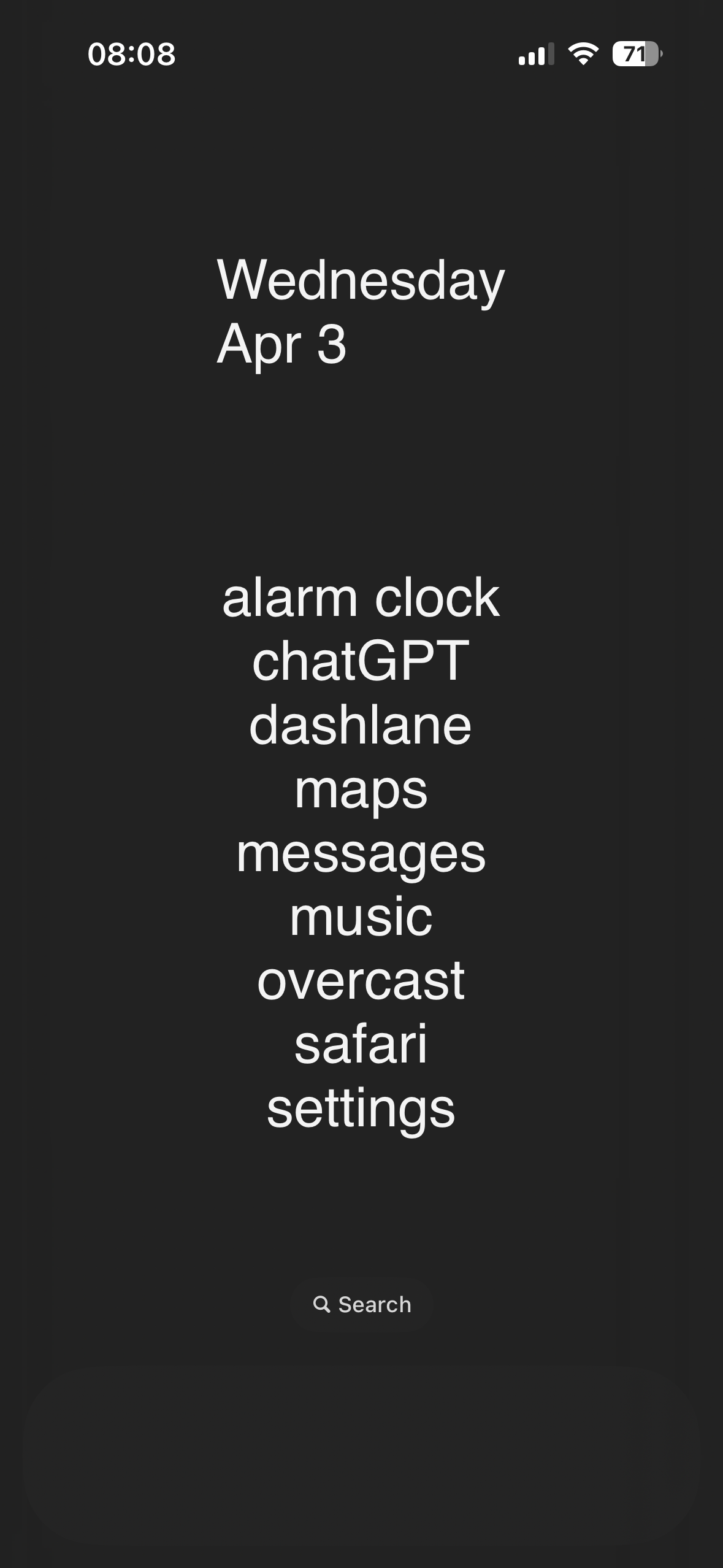
My Home Screen
Are they letting you guys keep your screens on yet? Or is that something that’s being saved for 19? Probably not a big deal for most, but an always on display for time, calendar, and alerts without having to do anything to active my phone is clutch for me. When I see other peoples phones with blank black screens they look so dead.
Fucking weird comment
Just use the little arrows next time mate.
This is what my homescreen looks like and apple’s struggling with placement of icons?

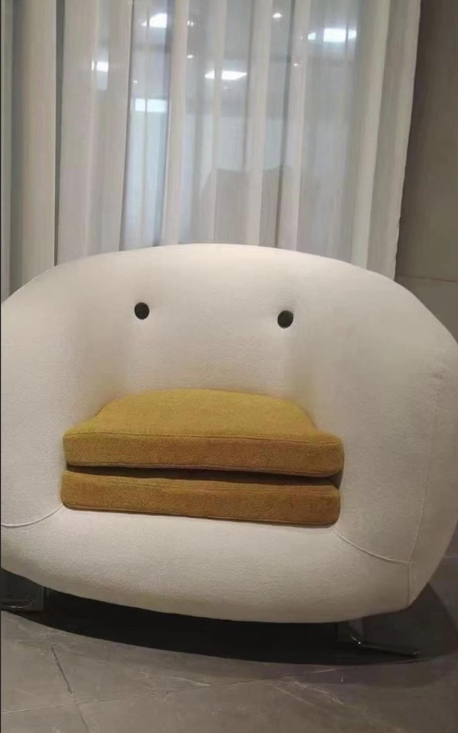
Edit: for those asking for theme, below is the video with instructions and apps used. https://youtu.be/UQKIUycDfQg Can’t guarantee if it’ll work for you.
that is 🔥 ! how though?
Total launcher. Had to design whole thing though. The theme is based on nier: automata game ui.
I immediately recognised the game UI - well done!
I don’t get it, I’m on iOS 17 and can move them around? I came from a pixel and I was surprised that you could. And you can also stack widgets which is nice
Where is the clip at the bottom from?
I used to work with an Apple fanboy that knew next to nothing about how computers actually work, but he knew that Apple was the best at everything. Any time someone brought up something about a device or service from any other company or with any other OS, his stock answer was always “switch to Apple”. Any time someone pointed out that their device offered a feature or functionality they appreciated that Apple did not offer in a convenient way, his stock answer was always “You don’t need that.” Sometimes he’d add “why would you want to do that? Do X instead”.
Fast forward to today, I ended up killing him and am writing this from jail.
To be fair, as both an iOS and Android user, the way android moves icons around drives me crazy , I much prefer the iOS “shift everything down” approach
Isn’t that launcher dependent?
Not sure, I have a Pixel and use the stock everything

Glad I’m on iPhone where I don’t have to worry about “launchers” and everything works out of the box.
Androids work out of the box too. The point is if you don’t like the way it works you can find alternatives. If you like stock iPhone that’s fine but I find it claustrophobic.
Ignorance. The mark of a true apple cult follower.
Happy because no choice. Android works pretty well with default one but lauchers helps to overthrow what oem gives
You’re talking to a bunch of geeks. There’s nothing wrong with the default pixel launcher. I used it for years. Most of these people have a butt ugly home screen and all kinds of ridiculous customizations that no one else has time for.
I cannot refute any of this.
Well… There’s yer problem
As an exclusively Android user, I couldn’t agree more
Get a new launcher in your life!
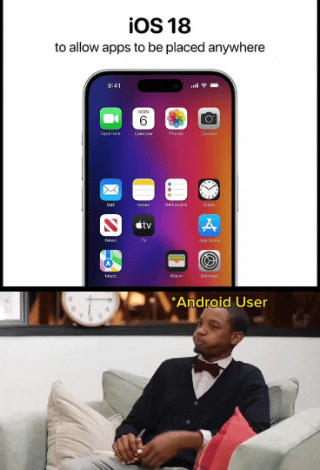
This was not allowed before. Until just recently, the technology didn’t exist to place icons anywhere in the grid. They would automatically smoosh up into orderly rows starting at the top-left with no gaps between icons. Apple is continuing to develop cutting edge innovation, though, and now you will be able to leave entire rows and columns empty, or any specific icon space you choose!
Seems like a trivial programming task even my junior noob ass can handle.
Actually it’s because apps aren’t neutrally buoyant in the OS, they naturally float to the top
Counterpoint: green bubbles.
Counter counterpoint: no one cares what color the bubbles are, except the person reading em. Sounds like an iOS problem 😉


